Branding a Temporary Structure: Why Bigger Is Not Always Better
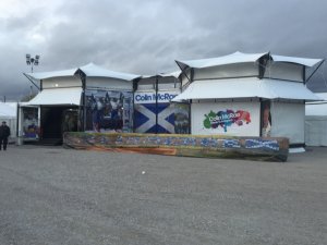
Event graphics have two jobs: communicate quickly and work safely with the structure. Covering every surface with a logo can achieve neither.
Start with the viewing distance
A message designed to be read from 50 metres away should not be treated like a brochure. At busy outdoor events, visitors often have only seconds to identify who you are and decide whether to approach. Strong hierarchy and fewer words usually outperform visual clutter.
Use architecture as part of the identity
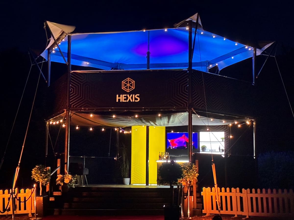
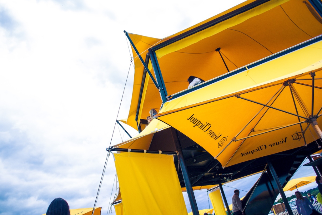
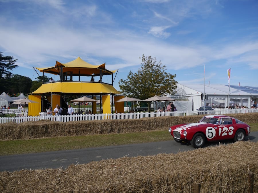
HEXIS has a distinctive carbon-fibre and stainless-steel aesthetic. Some brands may want to leave much of that engineering visible and use restrained graphics; others may treat the structure as a blank canvas. Both can work if the treatment is intentional.
Every attachment has a consequence
External banners, solid panels, flags, screens and signs can introduce loads or create wind resistance. Their size, material, position and fixing method should be approved as part of the project rather than added by a separate supplier without coordination.
Think day and night
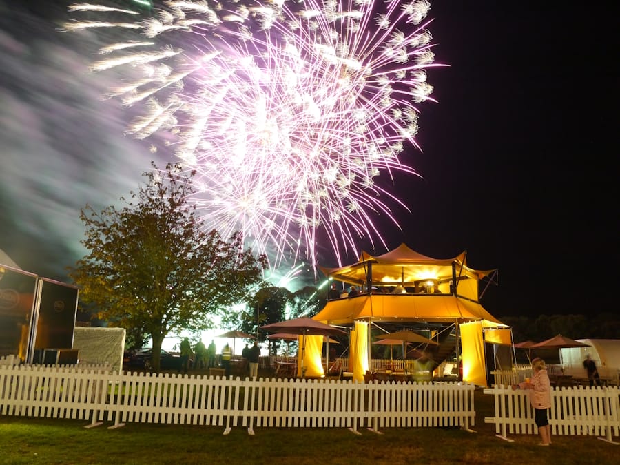
A graphic scheme that works in sunlight may disappear after dusk. Integrated lightboxes, carefully placed illumination and controlled colour can make the architecture work harder without increasing the quantity of printed material.
Design for reuse
If the event programme includes several venues, consider graphic dimensions and fixing systems that can travel with the structure. Reusable fabric, replaceable message panels and modular branded elements can reduce waste and simplify future activations.
Talk to Access Displays
If you are planning an outdoor event and want to explore whether HEXIS could add value, speak to the Access Displays team early. We can discuss the objective, venue, dates, likely configuration and the practical information needed to move from an idea to a deliverable project.